FORECASTING CRIME USING TIME SERIES

“The world is full of obvious things which nobody by any chance ever observes.”
-Arthur Conan Doyle
Yes, it can’t be observable but today using huge amount of data we can predict upcoming rate of crime and take proper actions, revise our policies. All this can be done by using some simple statistical tools. Here, I am going to forecast upcoming crime rates in Boston city, does it follow a pattern? Does it increase in certain period of time or just a random trend? To do this forecast I will use Time Series.

CONTENTS:
- What is Time Series
- My goal of this project
- Small tour of my data
- Data preparation
- Data Visualization
- Detrending the series
- Stationarity check (ADF test)
- Determination of parameters(p,d,q)
- Arima Model
- Forecast
- Visualizing the forecast
- What is Time Series?
A series of observations ordered along a single dimension, time, is called a time series. In statistical sense, a time series is a random variable ordered in time.
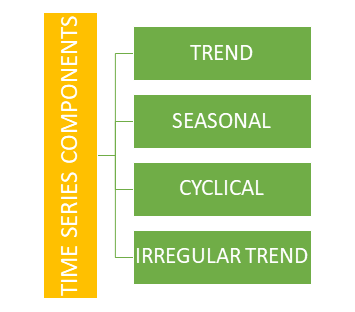
Time Series has Four component:
- Why we need time series analysis in forecasting process?
By definition we already knew that, A time series is defined in popular sense as a sequence of observations on a variable over time and time series data are a collection of observation made sequentially in time, either hourly, daily, weekly, monthly, quarterly or yearly basis. So, using time series data and analyzing this type of data we can forecast upcoming possible trends.
In this blog I am analyzing a univariate time series model.
- So, what is univariate time series?
Uni variate time series consists of single observation recorded sequentially over equal time increments. In this project there is only one variable that is crime counts which is recorded over a certain period of time.
- My goal of this project:
Crime incident reports are provided by Boston Police Department (BPD) to document the initial details surrounding an incident to which BPD officers respond. This is a data set containing records from the new crime incident report system, which includes a reduced set of fields focused on capturing the type of incident as well as when and where it occurred. My, goal is to predict the up coming trend of crime in Boston city using time series analysis.
My goal of this project:
Crime incident reports are provided by Boston Police Department (BPD) to document the initial details surrounding an incident to which BPD officers respond. This is a data set containing records from the new crime incident report system, which includes a reduced set of fields focused on capturing the type of incident as well as when and where it occurred. My, goal is to predict the upcoming trend of crime in Boston city using time series analysis.
Let’s have a tour of my Time series data:
df=pd.read_excel('crime.xlsx',encoding='latin-1')
df.head()
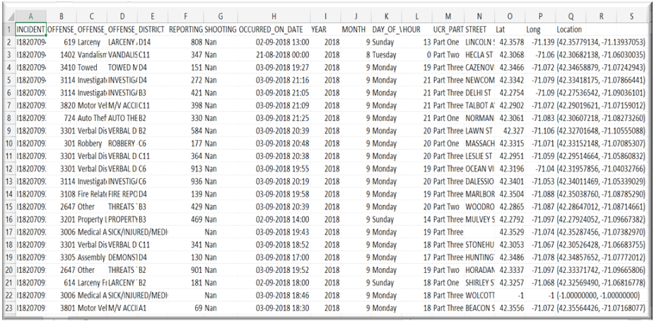
Here we have 17 variables. This project is all about univariate time series so, we only require two columns. Indexing is a part of Data preparation. Let’s Have an idea about Univariate time series.
Univariate time series:
Uni variate time series consists of single observation recorded sequentially over equal time increments. In this project there is only one variable that is crime counts which is recorded over a certain period of time.
- Data Preparation:
In any analytics project data preparation is the first step. Under data preparation there are few steps to follow.
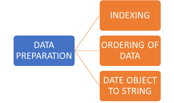
- INDEXING:
def createdf(c1,d1,c2,d2):
    dic = {c1:d1,c2:d2}
    df = pd.DataFrame(dic)
    return df
c = createdf("Date",df["DATE"].value_counts().index,"Count",df["DATE"].value_counts())
c.head()
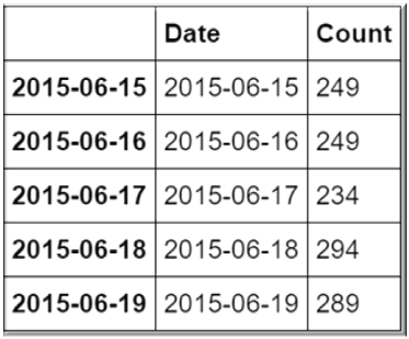
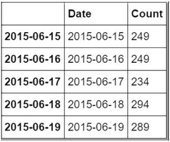
Now, we have two columns. ‘Count’ of crime and crimes occurred on ‘Date’. Now, our huge data with 17 columns transformed into a univariate time series data.
ORDERING OF THE DATA:
d=c.sort_values(by="Date",ascending = True)
d.head()
DATE OBJECT TO STRING:
import datetime
df['DATE']=pd.to_datetime(df['OCCURRED_ON_DATE']).dt.date
- Data Visualization:
c.index=pd.to_datetime(c.index)
Y=c['Count'].resample('MS').mean()
Y.plot(figsize=(15,6))
plt.show()
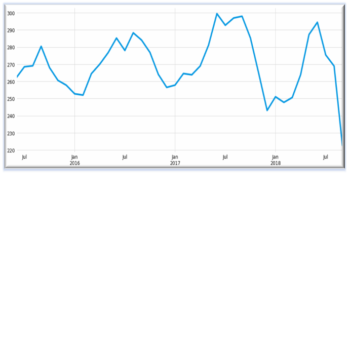
WHAT WE HAVE FOUND FROM VISUALIZATION?
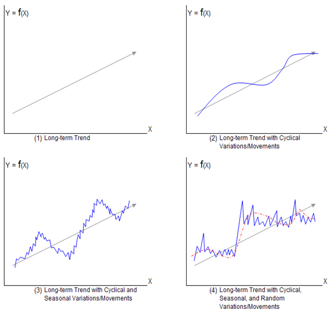
We have plotted count of crimes against date. We can see every year in January crime rate is at its lowest rate and it took a sharp rise in June and August. We can see a seasonal trend in crime and there is also a trend. Throughout the year crime rate has its ups and downs. Consequently, we can conclude there is a trend and seasonal component in this time series data.
LET US BE SURE THIS TIME SERIES IS NON-STATIONARY:
We will use a statistical test which is Augmented Dickey-Fuller(adf) test to see if the series is non-stationary or not.
def test_stationarity(series,mlag = 365, lag = None,):
    print('ADF Test Result')
    res = adfuller(series, maxlag = mlag, autolag = lag)
    output = pd.Series(res[0:4],index = ['Test Statistic', 'p value', 'used lag', 'Number of observations used'])
    for key, value in res[4].items():
        output['Critical Value ' + key] = value
    print(output)
test_stationarity(d['Count'],lag='AIC')
ADF Test Result
Test Statistic                   -2.237273
p value                           0.192997
used lag                         34.000000
Number of observations used    1142.000000
Critical Value 1%                -3.436089
Critical Value 5%                -2.864074
Critical Value 10%               -2.568119
dtype: float64
What we have from this result?
In ADF test null hypothesis(H0): The series is non-stationary
And, alternative hypothesis(H1): The series is stationary
If p-value>0.05, we will accept H0
And if, p-value<0.05, we will reject H1
From above result, we have p-value=0.192997, which is greater than 0.05. Hence, we accept null hypothesis and we found that our series is non-stationary.
- IN ANY TIME SERIES ANALYSIS, WE HAVE TO MAKE THE SERIES STATIONARY. IN A STATIONARY SERIES, THE VARIABLES ARE INVARIANT TO TIME. ONLY AFTER MAKING THE SERIES STATIONARY, WE CAN FORECAST PROPERLY.
- WE CAN DETREND A TIME SERIES TO MAKE IT STATIONARY
There are three process to detrend a non stationary time series-
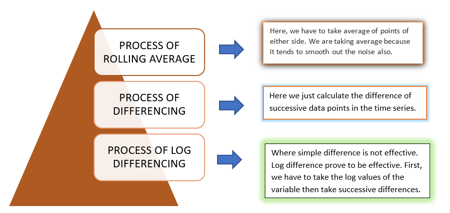
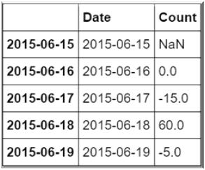
To detrend this time series, here I have chosen the process of differencing:
import seaborn as sns
d1 = d.copy()
d1['Count'] = d1['Count'].diff(1)
d1.head()
Now, let’s see if our series became stationary or not again using ADF test:
import math
print('Average= '+str(d1['Count'].mean()))
print('Std= ' + str(d1['Count'].std()))
print('SE= ' + str(d1['Count'].std()/math.sqrt(len(d1))))
print(test_stationarity(d1['Count'],lag = 'AIC'))
Average= -0.06207482993197279
Std= 37.349601593334036
SE= 1.0891364999989281
ADF Test Result
Test Statistic                -9.988185e+00
p value                        2.029010e-17
used lag                       3.300000e+01
Number of observations used    1.142000e+03
Critical Value 1%             -3.436089e+00
Critical Value 5%             -2.864074e+00
Critical Value 10%            -2.568119e+00
dtype: float64
None
Now, our p-value is 2.029010e-17, which is less than 0.05. Hence, we reject our null hypothesis. Consequently, we can see after taking first difference our time series became STATIONARY. Hence,d=1. Now, our next task is to determine the parameters for ARIMA model to do the forecast.
ARIMA:
ARIMA (Auto Regressive Integrated Moving Average) models are denoted with the notation ARIMA(p,d,q). These three parameters are accounted for seasonality, trend and noise in the data.
PARAMETERS OF ARIMA:
p: No. of lag observations included in the model.
d: degree of differencing
q: The order of Moving Average
To determine p and q we will use acf (auto correlation function) and pacf (partial auto correlation function) plot which are known as correlograms.
from statsmodels.graphics.tsaplots import plot_acf,plot_pacf
fig = plt.figure(figsize=(16,16))
ax1 = fig.add_subplot(411)
fig = plot_acf(d["Count"],lags=200,ax=ax1)
plt.title('Autocorrelation Lag=200')
ax2 = fig.add_subplot(412)
fig = plot_pacf(d["Count"],lags=200,ax=ax2)
plt.title('Partial Autocorrelation Lag=200')
ax3 = fig.add_subplot(413)
fig = plot_acf(d["Count"],lags=15,ax=ax3)
plt.title('Autocorrelation Lag=15')
ax4 = fig.add_subplot(414)
fig = plot_pacf(d["Count"],lags=15,ax=ax4)
plt.title('Partial Autocorrelation Lag=15')
plt.subplots_adjust(left=None, bottom=None, right=None, top=None,
                wspace=None, hspace=0.5)
plt.show()


Here, are the acf and pacf plot for lag 200 and lag 15.
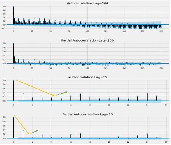
- Now, here comes the interesting part. How will we determine p and q from correlogram?
In the above diagram autocorrelation lag=15, we can see after 5th lag spikes are again rising. Hence, our p will be, (5-1)=4
For determining q, similarly we can see in partial autocorrelation lag=15, after 3rd lag spikes are again rising. Hence, our q will be, (3-1) =2
Hurrah!!! We have determined ARIMA parameters.
The parameters are, p=4, d=1, q=2
Now, let us see the results of ARIMA model:
timeseries =d ['Count']
p,d,q = (4,1,2)
arima_mod = ARIMA(timeseries,(p,d,q)).fit()
summary = (arima_mod.summary2(alpha=.05, float_format="%.8f"))
print(summary)
Results: ARIMA
====================================================================
Model:              ARIMA            BIC:                 11362.8143
Dependent Variable: D.Count          Log-Likelihood:      -5653.1
Date:               2020-07-29 20:17 Scale:               1.0000
No. Observations:   1176             Method:              css-mle
Df Model:           7                Sample:              06-16-2015
Df Residuals:       1169                                  09-03-2018
Converged:          1.0000           S.D. of innovations: 29.586
No. Iterations:     15.0000          HQIC:                11337.549
AIC:                11322.2553
---------------------------------------------------------------------
                  Coef.   Std.Err.     t     P>|t|    [0.025   0.975]
---------------------------------------------------------------------
const            -0.0037    0.0642  -0.0579  0.9539  -0.1295   0.1221
ar.L1.D.Count     0.4726    0.1516   3.1170  0.0019   0.1754   0.7698
ar.L2.D.Count    -0.1683    0.0461  -3.6534  0.0003  -0.2586  -0.0780
ar.L3.D.Count     0.0457    0.0354   1.2917  0.1967  -0.0236   0.1151
ar.L4.D.Count    -0.0910    0.0309  -2.9471  0.0033  -0.1516  -0.0305
ma.L1.D.Count    -1.1940    0.1500  -7.9578  0.0000  -1.4880  -0.8999
ma.L2.D.Count     0.2485    0.1406   1.7669  0.0775  -0.0271   0.5241
-----------------------------------------------------------------------------
                 Real           Imaginary          Modulus          Frequency
-----------------------------------------------------------------------------
AR.1            1.2461            -1.0366           1.6209            -0.1104
AR.2            1.2461             1.0366           1.6209             0.1104
AR.3           -0.9950            -1.7864           2.0448            -0.3309
AR.4           -0.9950             1.7864           2.0448             0.3309
MA.1            1.0805             0.0000           1.0805             0.0000
MA.2            3.7246             0.0000           3.7246             0.0000
====================================================================
VISUALIZING OUR MODEL:
predict_data = model.predict(start='2016-07-01', end='2017-07-01', dynamic = False)
timeseries.index = pd.DatetimeIndex(timeseries.index)
fig, ax = plt.subplots(figsize=(20, 15))
ax = timeseries.plot(ax=ax)
predict_data.plot(ax=ax)
plt.show()
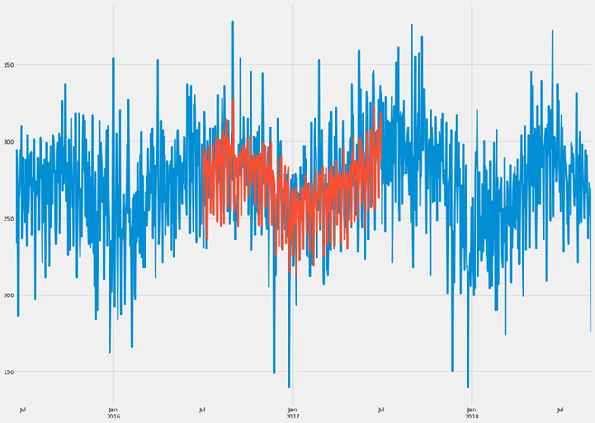
BLUE PART IS OUR OBSERVATION AND ORANGE PART IS OUR PREDICTED MODEL.
WOW, IT’S AMAZING!!!!
There is not much difference in observed and predicted model. We can say, it is a very good fitted model.
Now, the final part!!!!!
FORECAST FOR COMING MONTHS:
pred_uc = model.get_forecast(steps=30)

# Get confidence intervals of forecasts
pred_ci = pred_uc.conf_int()
ax = ts['Count'][-60:].plot(label='observed', figsize=(15, 10))
pred_uc.predicted_mean.plot(ax=ax, label='Forecast')
ax.fill_between(pred_ci.index,
                pred_ci.iloc[:, 0],
                pred_ci.iloc[:, 1], color='k', alpha=.25)
ax.set_xlabel('Date')
ax.set_ylabel('Counts')

plt.legend()
plt.show()
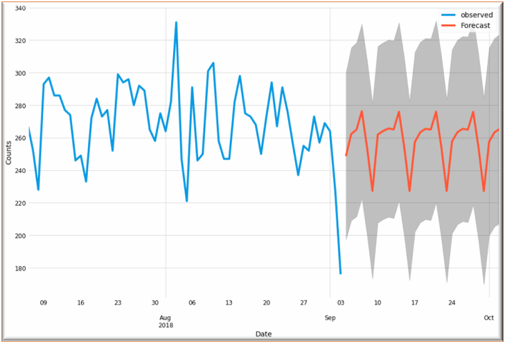
From our above diagram, we can see a trend in crime rate in coming months. It’s like a cyclical trend. It goes down in certain months and again increases rapidly.
CONCLUSION:
From visualizing our model, we have concluded it is a good fitted model and can say our forecast is almost accurate. Hence, govt. should take some steps to break this trend.
NOTE: If you have any doubt feel free to comment


I want to express my appreciation to this writer for rescuing me from this particular trouble. Just after researching throughout the internet and obtaining things which are not beneficial, I thought my entire life was over. Existing devoid of the solutions to the difficulties you’ve resolved all through your guideline is a serious case, and ones that might have adversely affected my career if I hadn’t encountered your blog. Your own skills and kindness in touching a lot of stuff was excellent. I am not sure what I would’ve done if I hadn’t discovered such a solution like this. I can now look forward to my future. Thank you very much for the specialized and results-oriented guide. I won’t be reluctant to propose your blog post to anybody who should get counselling about this situation.
Thank you so much for your appreciation.
I have to show some appreciation to the writer for rescuing me from this matter. After looking out throughout the internet and finding principles that were not beneficial, I believed my entire life was done. Being alive without the answers to the problems you’ve sorted out by means of the report is a crucial case, as well as the kind which might have adversely damaged my entire career if I had not noticed the blog. That capability and kindness in controlling every item was crucial. I don’t know what I would have done if I had not discovered such a solution like this. I can now look forward to my future. Thanks so much for this impressive and amazing help. I won’t be reluctant to suggest the blog to anyone who will need guidance on this issue.